|
Already an established locksmith? Trying to get your new locksmith business off the ground? Need training or licensing? Have to get bonded and insured? Visit here to talk about running a locksmith business day to day, including buying a van, renting a store front, getting business cards and invoices made up, questions on taxes, pricing out jobs, what to spend on tools and what works and doesn't in advertizing.
 by MSL » 22 Jun 2014 7:51 by MSL » 22 Jun 2014 7:51
I had someone draw me up a logo. Since I work in a prison, I figured that was what I was going to use as my angle. And I figured sex sells, so here's what I got. What do you folks think? 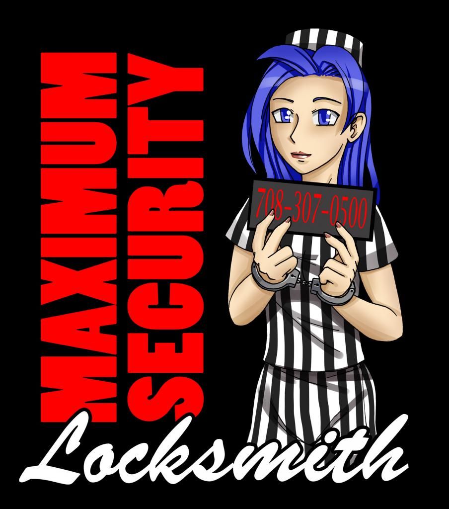
-
MSL
- Supporter

-
- Posts: 108
- Joined: 9 Apr 2014 21:57
- Location: Illinois
by GWiens2001 » 22 Jun 2014 8:00
Dang, MSL! Give that inmate an extra pouch of tobacco. That is pretty good.
Gordon
Just when you finally think you have learned it all, that is when you learn that you don't know anything yet.
-

GWiens2001
- Site Admin
-
- Posts: 7659
- Joined: 3 Sep 2012 16:24
- Location: Arizona, United States
by Sinifar » 22 Jun 2014 9:53
A company logo represents the firm, much like an avatar does. It is your "face" to the public when you are not around.
What does this logo say about you? Are you happy with what it represents? Is that what you want the public to think about you, your firm, your level of service or anything else concerning your company? What about negative blow back from the public and especially clients reactions to it?
Take the drawing, and test it on your current clients and see what they think of it before you commit to anything.
Take it to a sign shop and find out what this is going to cost you to reproduce. Talk to a stationer and find out what this is going to cost you for letterheads, business cards, and advertising copy.
Since we are talking about costs, do you have a release from the artist? There may be copyright infringements of the work, you need a release before you can use anything you have not done yourself.
It's not too bad overall -- it might be considered "sexist" due to a female model -- get rid of the "body lines", especially the ones on the bottom, and make her more plain, in the striped suit. It could work, but as a security professional I would not use something this provocative in todays politically correct world.
You don't want to see some of our rejected ideas. We had some really good ones in the day, but our panel of advisers said much what I said and this prevented a negative blow back. You don't want such a cute or sexy logo to come back at you.
Just my advise, take it for what it is worth, it is your business.
Sinifar
The early bird may get the worm, but it is the second mouse which gets the cheese!
The only easy day was yesterday.
Celebrating my 50th year in the trade!
-
Sinifar
-
- Posts: 352
- Joined: 24 Feb 2013 11:23
- Location: Securing the Kettle Moraine since 1972
by MacGnG1 » 22 Jun 2014 12:54
That's nice! I like it!  Nibbler: The poop-eradication is but one aspect of your importance.
-
MacGnG1
- Supporter
-
- Posts: 1362
- Joined: 9 Apr 2008 22:14
- Location: Know Where, MD, USA
-
by MSL » 22 Jun 2014 20:48
Sinifar wrote:A company logo represents the firm, much like an avatar does. It is your "face" to the public when you are not around.
What does this logo say about you? Are you happy with what it represents? Is that what you want the public to think about you, your firm, your level of service or anything else concerning your company? What about negative blow back from the public and especially clients reactions to it?
Take the drawing, and test it on your current clients and see what they think of it before you commit to anything.
Take it to a sign shop and find out what this is going to cost you to reproduce. Talk to a stationer and find out what this is going to cost you for letterheads, business cards, and advertising copy.
Since we are talking about costs, do you have a release from the artist? There may be copyright infringements of the work, you need a release before you can use anything you have not done yourself.
It's not too bad overall -- it might be considered "sexist" due to a female model -- get rid of the "body lines", especially the ones on the bottom, and make her more plain, in the striped suit. It could work, but as a security professional I would not use something this provocative in todays politically correct world.
You don't want to see some of our rejected ideas. We had some really good ones in the day, but our panel of advisers said much what I said and this prevented a negative blow back. You don't want such a cute or sexy logo to come back at you.
Just my advise, take it for what it is worth, it is your business.
Sinifar
Since it was a work for hire I don't imagine I should have any problems getting it reproduced. And honestly this is a toned down version, you should see the picture this was based on. http://sozokureed.deviantart.com/art/Bo ... -392431151I didn't even noticed the lines down there. And while it may seem a little sexist, it is if nothing else eye-catching and will make people look at the back of the van a little more carefully, where my web address will be. I plan to have a serious website, but will a little camp to make it interesting.
-
MSL
- Supporter
-
- Posts: 108
- Joined: 9 Apr 2014 21:57
- Location: Illinois
by cledry » 22 Jun 2014 22:28
Personally if I was hiring a locksmith I wouldn't choose one with your logo. Not that one should hire based on a logo, but a locksmith with a connection to jail on their logo doesn't exactly inspire trust.
Jim
-

cledry
-
- Posts: 2836
- Joined: 7 Mar 2009 23:29
- Location: Orlando
-
by MSL » 22 Jun 2014 23:41
Someone who doesn't trust people with a connection to a jail wouldn't hire me in the first place. 
-
MSL
- Supporter
-
- Posts: 108
- Joined: 9 Apr 2014 21:57
- Location: Illinois
by cledry » 23 Jun 2014 5:58
MSL wrote:Someone who doesn't trust people with a connection to a jail wouldn't hire me in the first place.
I'm not saying they wouldn't trust you because you work at a jail. I am saying I wouldn't advertise with a criminal on my logo, but that is just my opinion. Jim
-
cledry
-
- Posts: 2836
- Joined: 7 Mar 2009 23:29
- Location: Orlando
-
by billdeserthills » 23 Jun 2014 16:54
I think you should just call it Felony Lock and get it over with
-
billdeserthills
-
- Posts: 3870
- Joined: 19 Mar 2014 21:11
- Location: Arizona
by GWiens2001 » 23 Jun 2014 20:50
billdeserthills wrote:I think you should just call it Felony Lock and get it over with
Felony Lock... We will get in your place by hook or crook!  Gordon Just when you finally think you have learned it all, that is when you learn that you don't know anything yet.
-
GWiens2001
- Site Admin
-
- Posts: 7659
- Joined: 3 Sep 2012 16:24
- Location: Arizona, United States
by MSL » 23 Jun 2014 23:43
There was a hot dog place not too far from me that only hired ex-cons it was called Felony Frank's. Home of the misdemeanor wiener. It had a hot dog in a striped costume as its logo as well.
-
MSL
- Supporter
-
- Posts: 108
- Joined: 9 Apr 2014 21:57
- Location: Illinois
by 2octops » 24 Jun 2014 1:28
It's your business and if you like it, then use it! After all, ain't nobody else here going to pay for it.
One thing to consider, make your phone number much larger and bolder.
If this is going on the outside of a vehicle, it needs to be clear and large enough for people to read the main points (what you do and how to contact you) from across a parking lot, as they pass you in traffic and as you drive down the road while they are standing still in a parking lot.
Pay attention to other service vehicles and their lettering as you are driving around and walking around town.
There is nothing worse than letters to small (or to much info) where you have no clue what that person does for a living when you see them driving past or how to contact them.
-
2octops
-
- Posts: 789
- Joined: 12 May 2005 16:35
- Location: Georgia
by dmcintyre86 » 24 Jun 2014 13:43
I was also going to recommend making the Ph # bigger and maybe bolder as well
I actually like this design...its eye catching, and modern!
I hear everyone else's concerns as well...but i tend to think people will do business with you based on your reputation rather than whats on your logo...i would bet that you get a lot of conversations begun over the logo in question...which in turn boosts your visibility in the community and may lead to more business.
-
dmcintyre86
-
- Posts: 53
- Joined: 13 May 2014 16:53
- Location: Murrieta CA.
by alockguru » 14 Feb 2015 11:48
The arts fine but IMO its a bad company logo. Anime just doesnt look mature enough for a pro locksmith. Specially one with a strong name like yours. Id start from scratch.
-
alockguru
-
- Posts: 83
- Joined: 4 Jun 2013 18:33
- Location: 'Merica
by deralian » 14 Feb 2015 15:24
The design and name are very catching. But I have to agree that anime will detract from your professionalism. Most commercial clients would pass you over.
-
deralian
-
- Posts: 64
- Joined: 15 Dec 2014 12:49
- Location: Arizona
Return to Running a Business
Who is online
Users browsing this forum: No registered users and 4 guests
|